ADT Inc.
Home Security
ADT Inc. is an American company that provides residential, small and large business electronic security, fire protection, and other related alarm monitoring services throughout the United States.
01 INTRO
EXPERTISE
Front-End Development • UI/UX Design
BRIEF
The work done for ADT mostly included design, development, lead submission API capture solutions, script/tracking implementation, and rebranding rollouts.
All work depicted below was completed during my time working at Full Cup Creative.
02 BRAND
GUIDELINES
Although Full Cup Creative did not assist in any of ADT's rebranding efforts over the years, it was still on us to ensure that we adhered to any new guidelines that were put forth. Below is the most recent branding to leverage in the production of all visual assets.
TYPOGRAPHY
PRIMARY
Brown
COLOR PALETTE
PRIMARY
PRIMARY
PRIMARY
SECONDARY
SECONDARY
SECONDARY
SECONDARY
TERTIARY
TERTIARY
TERTIARY
TERTIARY
TERTIARY
03 DESIGN
GOOD, BETTER, BEST*
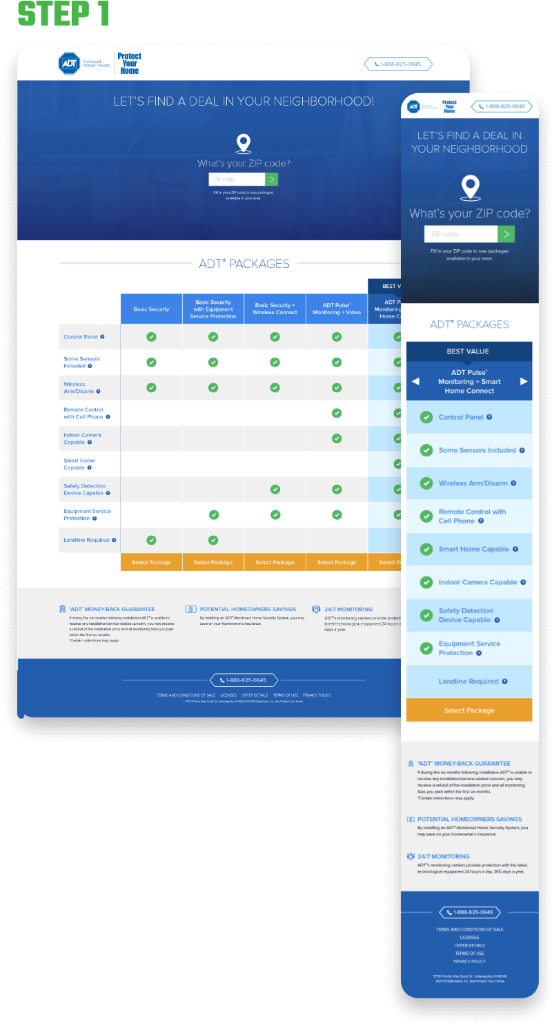
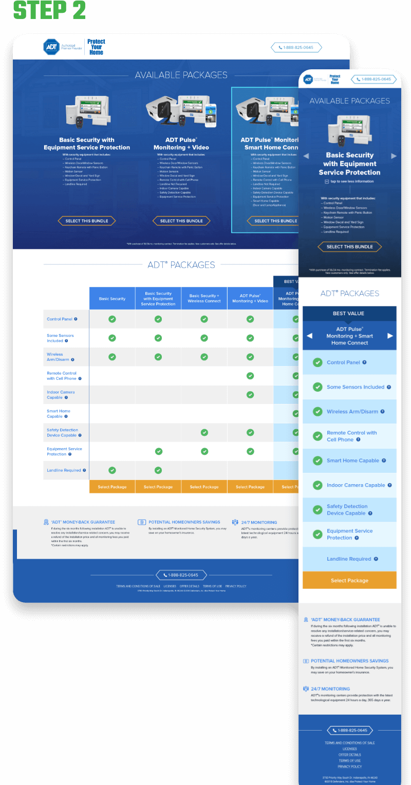
The client requested a 2-step eCommerce landing page for their indoor security camera bundles. More specifically, they wanted to highlight their "Good, Better, Best" packages (in that order), in a Goldilocks-esque marketing design.
Without much content or direction besides their desire for their "Good, Better, Best" packages, I set out to generate the mockups showcased below. Gradient overlays & bundle imagery was used in the hero section to generate immediate visual interest. Meanwhile, rather than created a purely text-based table, I leveraged iconography & color to maintain as much of the same degree of engagement as the hero.
*This set of mockups was designed prior to the eventual rebranding & color palette called out above in the "01 BRAND" section.
INDIGO LANDING PAGE
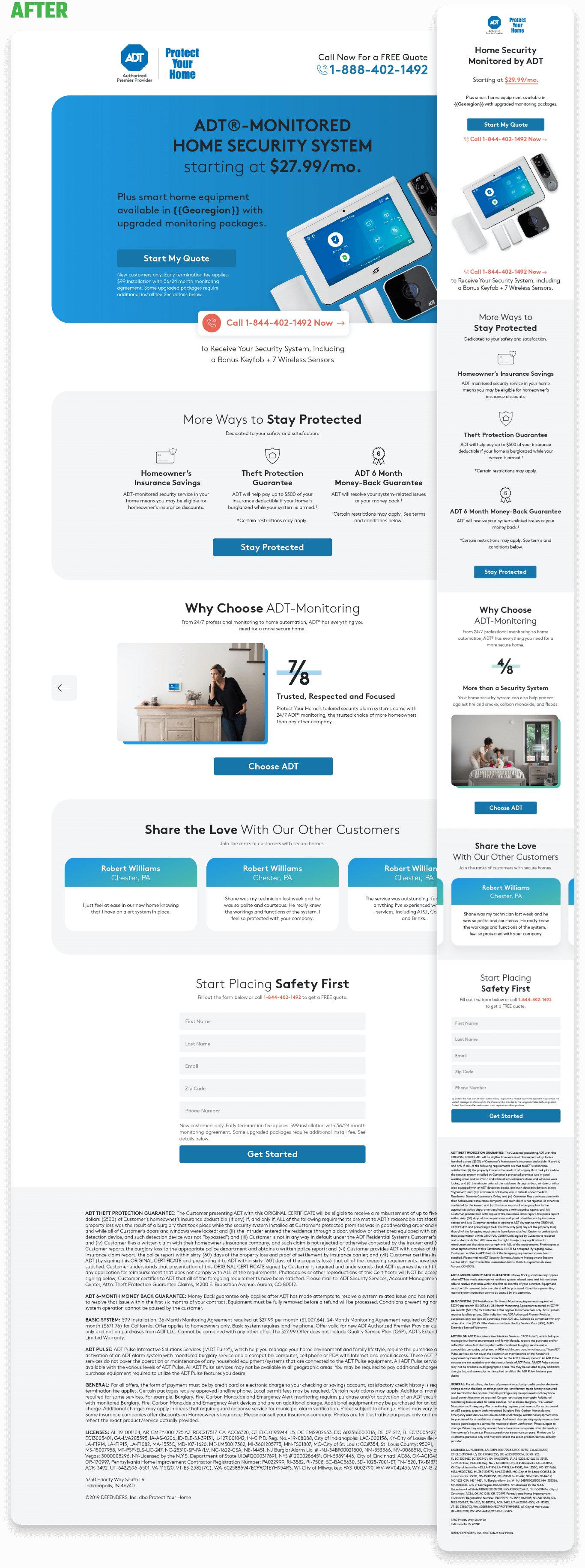
After a long run with what was known as the "Crazy Barnes" landing page design, ADT was finally ready to move onto greener pastures. With a design refresh was in the books, the client worked to put together something a little less archaic while also requesting the expertise of Full Cup Creative.
Among a number of landing pages deisgns that found themselves into the pool, the "Indigo"-coined design that I added to the mix was selected for development & go‑live.
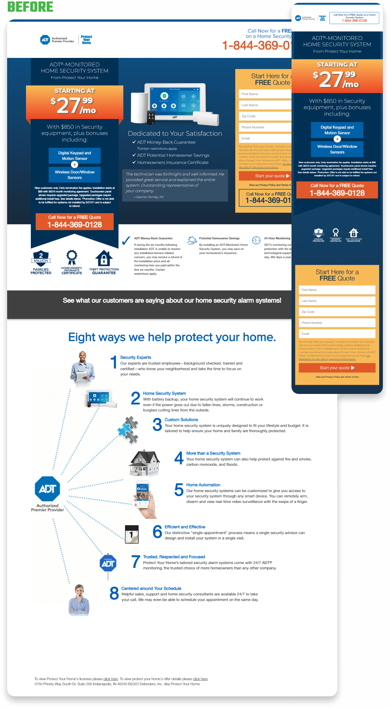
In their existing color palette, a reduction of color-usage was called for in order to create a clear distinction between accent & action colors. Ample whitespace was maintained to establish hierarchy and focal points per section, with typographic principles being employed for optimized legibility. Besides all that, the "Why Choose ADT-Monitoring" and testimonials sections were condensed into smaller sections via interactive carousel containers in order to both comfortably fit the provided copy & keep page-scroll to a minimum.
04 LP BUILDS
CROSS-CHANNEL LANDING PAGES
Unlike most other clients that Full Cup Creative has worked with, ADT didn't generate unique layouts for each channel. Rather, they recycled the same layouts across all channels, be it Search, Email, Direct Mail, Display, Social, etc.
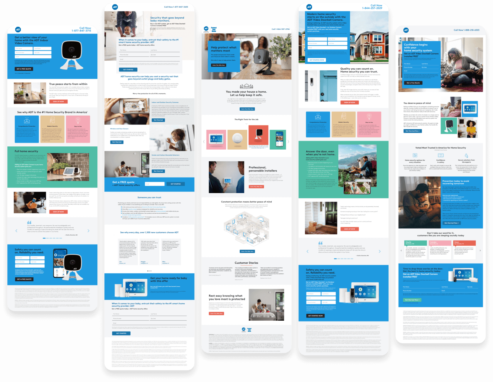
Below is a collection of landing page layouts that I developed for ADT's modular usage.
