Lunessence
Winery & Vineyard
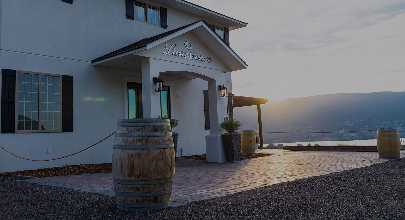
Lunessence Winery & Vineyard honours a commitment to crafting fine wines which showcase the unique terroir of the Okanagan Valley. Each bottle is a proud expression of the earth it came from.
01 INTRO
EXPERTISE
Branding/Identity • Product Design • UI/UX Design • Front‑End Development
BRIEF
Following the acquisition of what was formerly known as Sonoran Winery, Lunessence was in need of a rebrand to find its own identity & footing in the wine business. That's where I came into the picture — to help build their branding & styling from the group‑up.
02 BRAND
DEVELOPING THE BRAND
Through the initial rebranding, Lunessence was named Moonlight Valley Estate Winery. Logos were put together by other designers, but nothing was striking the note that the owners were looking for. After sitting down to discuss the vision that the owners had for the winery, we renamed it to Lunessence and I began my work on developing their brand.
LOGO
With the intention of keeping Lunessence anchored to a lunar motif, a circular (or crescent, at the very least) contour was drafted. Then, combined with the pouring of wine, a minimalistic but dynamic logo mark was produced, whose movement is paralleled by the script logo type.
TYPOGRAPHY
PRIMARY
Abel
SECONDARY
Questrial
COLOR PALETTE
PRIMARY
PRIMARY
SECONDARY
SECONDARY
SECONDARY

03 PRODUCT
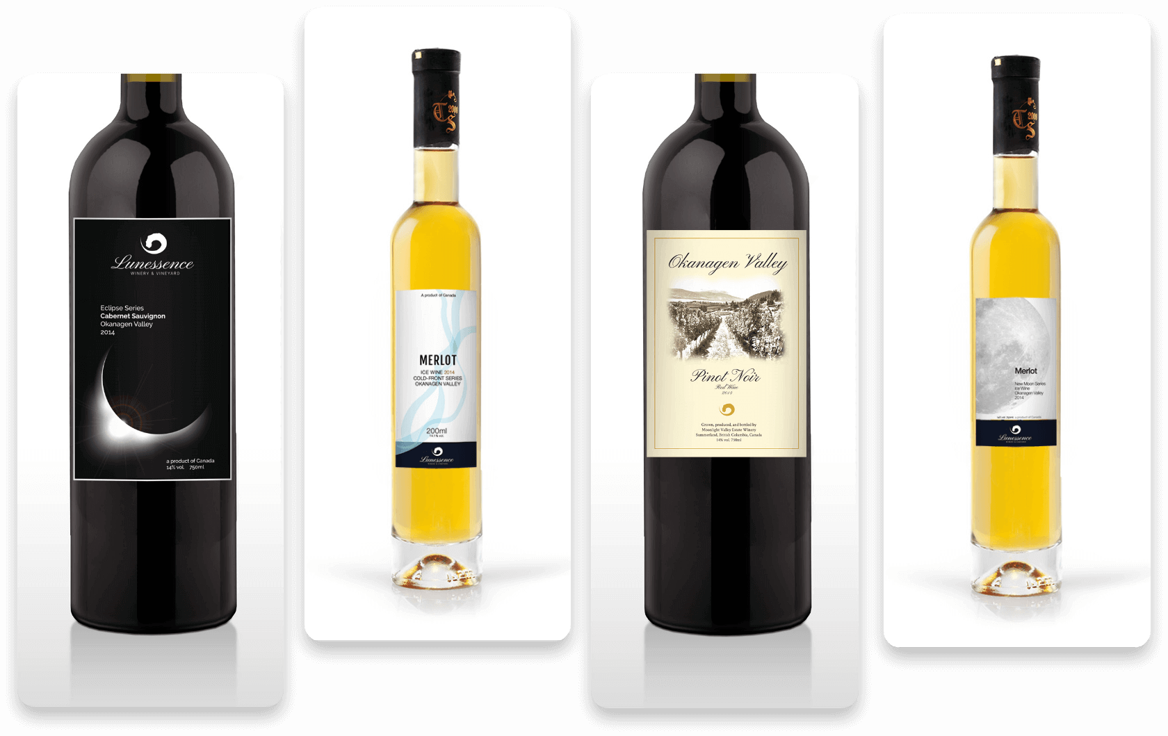
PROTOTYPE WINE LABELS
Showcased further down are mockups to guide general visual direction of labels moving forward, whether the owners sought to employ a more modern or traditional style of design for their wine labels. These were put together in tandem to the branding, as that entire process was being expedited. Therefore not all colors, fonts, etc. are a match to the guidelines established above in the "02 BRAND" section.

04 WEBSITE
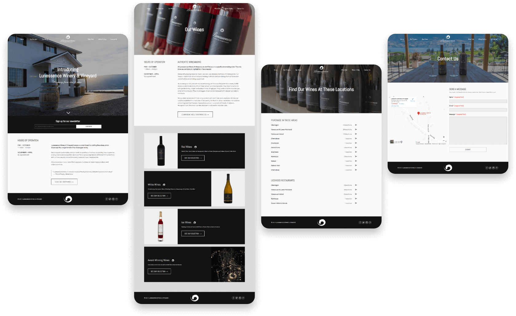
LUNESSNCEWINERY.COM
Although the current live website has changed a number of times, below is a set of selected page mockups that I put together at the time.
